Recently I shared a few images from my home, in particular, artwork created by my younger son.
 In exhibiting some of the pictures that adorn my walls, you may have noticed that I group my works fairly close together, and usually in a manner called salon-style. It’s something I swear by, though I know it doesn’t suit every space, or appeal to every taste.
But I’d like to offer more on this method of displaying art, which is centuries old. I also have a few nifty resources to mention, and several elegant illustrations of salon-style, compliments of back issues of one of my favorite magazines, Elle Décor.
Hanging art salon-style won’t entice the minimalists in the crowd, and if your space is extremely cluttered, floor to ceiling art – which is essentially what salon-style entails – will make your environment seem more overrun than it already is.
Origin and Elements of Salon Style Art Display
In case you’re wondering, salon style art display dates back to 17th century France, and the practice of holding art exhibitions in a single room. That meant covering the walls in a densely arranged set of works.
 Perhaps one of the reasons I favor this style is due to the time I’ve spent in Europe, where it remains commonplace to hang images and other objects in this fashion, certainly among the art lovers I know.
It isn’t about expensive work or even “important” work, but a desire to have visual access to many objects we love at once, in groupings that feel themselves like another work of art.
As for the floor to ceiling aspect, to be clear, that doesn’t mean you can’t have furnishings pushed against your walls. On the contrary, the mixing of art and furnishings is usually necessary, and creates additional visual interest.
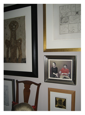
In this example of a partial wall, the space includes one of a pair of 18th century chairs which, to my eye, “just fits,” though my apologies for the photograph which doesn’t do the display justice. On the opposite wall is a similarly diverse group of works on paper, and the other chair – handled in the same way.
If anything, your tables, sofas, lamps, books – they all become part of the rhythm that blends with the artwork as your eye travels around the room, preferably in an engaging journey, moving from one object to the next.
 Salon Style in a Small Space?
Not only is salon-style a look I love, but one I’ve relied on for years, fessing up to the collector’s difficulty in parting with pictures that hold sentimental value, even as I’ve downsized.
Another relevant factor?
I live in a small space, and small space living demands that we use every inch to our advantage. But if we use common sense (and a few basic rules), that doesn’t preclude collections. I think of it like dressing a diminutive woman (which I am). What’s required is similar to following fashion guidelines to do with body type, size, pattern, and proportion.
That said, especially in close quarters, the rhythms, textures, colors, and dimensions of the pictures displayed need to harmonize.
In other words – too much variation will result in a mess! Instead, seek a sort of balance, as the combination of paintings, drawings, photographs or other objects as a whole forms its own composition.
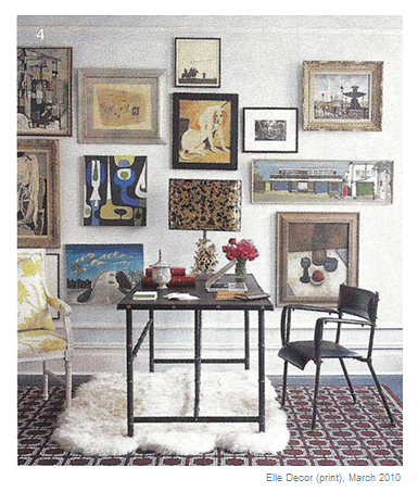
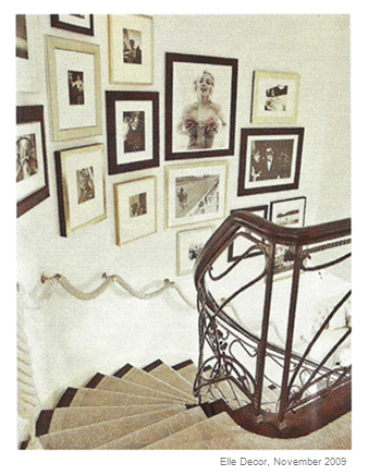
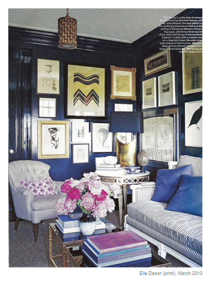
This might mean photographs with compatible matting and framing (as in the stairwell illustration below), paintings of like visual “heft” (as in the sitting room above), or a bolder mix when you enjoy the luxury of tall ceilings and a larger space, as in the gorgeous blue room, also illustrated below.
How to Hang Art Salon Style
For some, displaying art salon-style presents a veritable visual feast. For others, it’s jarring. For me, it’s energizing and allows me to rotate smaller pieces – switching them out here and there, and appreciating them all over again as a result.
But how do you start? How do you actually hang a cluster of small paintings or drawings without screwing it up?
You know the old saying – measure twice, cut once?
 It applies to measuring your artworks and walls before you drill three times as many holes as you need! I admit, after twenty years of hanging art, I’m reasonably adept at eyeballing where to hammer and hook, and one of the delights of salon style display is the fact that it isn’t perfect, and doesn’t need to be.
However, do note, as in this example from the November 2009 Elle Décor, hanging a collection of closely grouped pictures in a stairwell – in this case, an elegant collection of photographs – merits careful attention to the spacing between each image.
If you’re looking for how to do the measuring involved in hanging art exactly where you want it – one piece on center, for instance, and others grouped around it – Apartment Therapy features some guidelines on how to measure and display art, along with what they refer to as hanging in groups, or cluster hanging.
Those who love and live with art know that the eye “needs to rest” moving from one composition to the next. And yet, for some of us, there’s rest enough in the playful, chic, and eclectic display of floor to ceiling visuals – if it’s done right.
More musings on art:
Images, Elle Decor Magazine (print), November 2009, p. 120; March 2010, p. 62, p. 94. Wall of works on paper, yours truly. (Tamayo, Alechinsky, Parrott, Deux.)
Salon style, eh? Bill and I are discussing potential plans for redecorating the sitting room / living room. I like it fine the way it is, but being an older house the walls form cracks over time and this necessitates some work. Thinking about subtle changes in colours, furniture arrangement and what to put on the walls makes the boring part more fun (though Bill does most of the work, I find the upheaval extremely tedious). I think it was a book about Fairfax and Cole that made me think that the ‘English Country House’ style of picture hanging might work for us – we have so many unused pieces in the loft that could be fun to play with. So now I have a different name for that… And I’ve found all those posts about French style and all – I’m going to have some great fun reading all those posts! Thanks!
Glad you enjoyed this, Shelley. One of the things I love about displaying art this way is that it’s less formal (befitting an English Country House?) – you don’t have to be perfect.
I neglected to point out that one way to start the process is to take the pictures you know you want to display and lay them out on the floor. Play with them like puzzle pieces. When you like an arrangement – go for it! Measure the walls, the pictures, where your hooks need to go – and I generally work from the middle outward (or you might find yourself in trouble when you reach a wall).
It’s such an easy way to feel like you’re redecorating (without spending a dime), not to mention mixing things of no value to anyone but you, with special finds or acquisitions from family or collecting.
(And let me know how you like the French fashion series. It was fun to write!)
I have the opposite problem being a divorced dad on a budget, too many blank walls that need to be filled. Splitting up often leaves an asymmetry with respect to the wall art accumulated during marriage, the balance of memories vs. a clean slate. Also since the woman usually determines household decorating, I had little knowledge of what my tastes were so it has been interesting. My latest (cheap) purchase was a vintage 40+ year old John and Yoko War is over! postcard to mark my divorce finalization; it is framed and on the wall near my guitar, it is perfect on so many levels for me.
Ballad of John and Yoko
I understand, batticus. One of the things I used to do before I had more than a few pictures to hang was to display other things I loved or found interesting. I’ve hung chairs, strange wooden objects, utensils. (I probably should have hung my shoes on the wall.) And there’s nothing wrong with great posters or postcards!
But hey – drop me an email. I’ve got what is traditionally thought of as “masculine” taste when it comes to art. And I’m looking to streamline some more… (Have I got a deal for you… ;))
Salon style…around here, it’s the Barnes.
My children’s friends used to talk about visiting the museum (of horrors? of weird whatevers?) at our house. Much was historical and natural. My full walls and shelves have been coming down, as we work on downsizing.
There is also the issue of furnishings to be determined by two people and not just to your own individual taste. Challenging, or great fun?
I glare daily at some of the wide swaths of bare wall in our house. I want to adorn them, want to claim them, but something holds me back. This is going to be my push to get over that and finally just do it!
I love this style of display. It’s even better when the display includes art with special meanings (like that of a child!). I always think someday, I’m going to frame some of the endless photography shots I have in my archives. Someday.
I have a big wall in my living room that’s done this way and I love it. It always gets lots of comments too. I’d do my whole house this way if I could. I have a ton of artwork too, just no frames. I should be more vigilant at Goodwill for those things.