Exiled to Main Street, USA?
 Not exactly. But the remaining Season 2 artists – Kymia, Lola, Sara J, Young, and Dusty – enjoy a bit of train travel to the small New York town of Cold Spring for this latest challenge.
They are to explore their picturesque environment, seek out its inhabitants, spend $200 however they like, and create an All-American inspired portrait.
Easy, right?
And must we mention it’s a double elimination?
Main Street or Rain Street?
Main Street?
Rain Street is more like it. Flashing to the final five strolling the semi-deserted sidewalks on a dismal day, the open-ended assignment seems more an exercise in serendipity, resourcefulness, or futility. At least, until the artists begin exploring little shops and lighting on the loopy locals.
 As each artist kicks their false starts to the curb, creativity seeps in, along with a bit of luck.
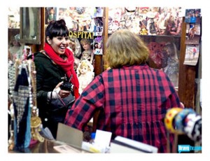
Young engages with another artist (Terence Donovan). Lola falls upon coin and currency collectors. Sara J’s ideas spark at the municipal fire station. And Kymia goes kitsch in a curiosity shop.
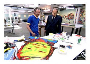
Dusty is drawn to a playful and bouncing little girl; he misses his wife and his one-year old daughter. Unfortunately, he’s stuck in the mud with his portrayal, and never manages to pull himself out.
Subjects, Medium, Process
 You can discover the most fascinating subject in the world to present, but if you can’t execute in an effective (or unexpected?) way, the result is dull.
You can select an interesting choice of medium that sounds good in concept, but if it’s predictable (or food!), unless you’re competing on Top Chef, you’ll quickly be under water.
As for artistic process, Dusty’s is uninspired, and likewise the outcome.
Young, in contrast?
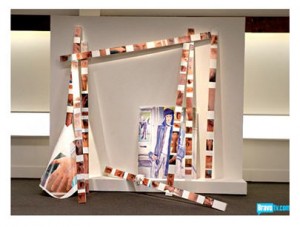
He is fortunate to find an abundantly able artist in Mr. Terence Donovan, who paints our intrepid contestant as Young shoots photographs of the artistic process. Resembling the exercise of a reflection in a reflection in a reflection (and I’ll stop there), Young goes on to feature his final installation with a reflective title: Terence by Young, Young by Terence.
Lola, Get It Together! (Sara, Take it Apart)
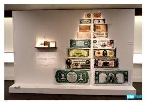
 Lola goes for another conceptual piece that is all too scattered, though inspired by a pair of gentlemen who know all-things-antique-currency. She loses herself in lack of focus, though she tearfully defends her work by saying that her letter to subjects Tommy and Dennis is a key part of her portrait concept.
While Sara J could have resorted to traditional figurative mode, she steps outside her comfort zone in terms of materials as well as concept.
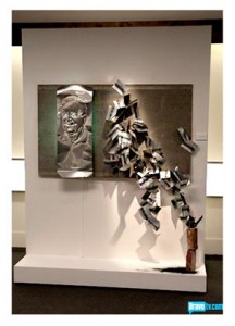
She punctures holes into metal to create a likeness of her firefighter Jackie, and representing his 58 years on the job, she abstracts metal forms and charcoal into a series of somethings. While it never quite gels, stacked on two bricks we might imagine a ladder. These two halves may leave a hole in our understanding, but the judges appreciate the risk Sara takes in stretching.
Kymia’s Win, Guest Judge Richard Phillips
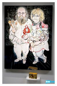
 Kymia’s couple of quirky collectors are featured in fairly traditional form, but by filling the background with strange drawings (and plentiful white space among other effective tricks), there’s an element of caricature that pleases the judges. Kymia (reasonably) takes the win.
And might the cartoon quality have also appealed to the guest judge?
Speaking of guest judge, this week it is Richard Phillips, himself a contemporary portrait artist whose figurative works are often large and colorful, offering commentaries with pop culture edge. (Check out his “Dollar Sign” image here.)
Might I add that the best showing of the night, in my opinion, was the energized brushwork by Terence Donovan in his portrait of Young?
No Money Shot
I can’t say that any of the final artworks in this episode wowed me, but I agree with the judges’ decision on who stays and who goes.
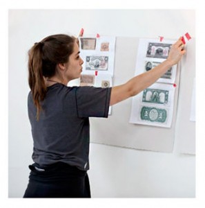 Dusty can’t pull it out, and his mosaic portrait is, as China says, “not special.” Lola gives the effort (and us) her theatrical thrall, but falls flat in her excessive execution.
It’s not that her idea is uninteresting, but what succeeds in Lola’s Episode 8 nude is the cohesiveness of concept and visual. Lola edited.
Here, she regresses to a little of this and a little of that, and even her notions of scale are out of kilter. This is no money shot; she could have come closer to the mark by enlarging the small sketch of Tommy and Dennis adorned with gold and silver leaf, or manipulated the material (currency) in some less obvious fashion.
Do not pass go. Do not collect, well… $200.
Terence Donovan?
 The judges may say that Young could have featured Terence Donovan’s portrait without the accompanying photography, but that’s silly. Surely they would have eliminated him for that, and the echoed lines and angles of the painted canvas are well suited to the image-on-wood installation that sets it off.
I can’t say that Young’s imagery is all to my liking (the large hand on the left seems out of scale), but overall, he meets the challenge, and I can imagine spending time in front of his photographic fragments as well as the central portrait. But I repeat: Should Mr. Donovan have gotten this win?
I would also suggest that Cold Spring’s good-natured citizens deserve a round of applause. How strange is it to be invaded by camera crews and the topic of television fodder?
Sliding into the Finale
 The thankful three? Kymia, Young, and Sara J.
I wouldn’t have called it in the beginning, but these three artists should make it an interesting Finale.
As for Season 2, it’s provided a far superior experience for the viewer (in my opinion), with more focus on process and less on drama. While we had our share of peculiar personalities (Hello, Sucklord?), three deserving artists will compete for the final prize.
And if you missed an episode, pop by here.
Images courtesy BravoTV.com. Click on images to access Bravo TV’s originals.
© D. A. Wolf
Nice write up. I too thought Dusty was both bored and completely uninspired. Like he was hitting a wall or something. I didn’t like most of his work as it was always a derivative of a previous work he had done.
I was thinking how Young added his picture in the composition to safeguard himself. That was clever, if he hadn’t the entire concept would have backfired and Jerry would have accused him of exploiting another artist.
Thank you for jumping into the contemporary art conversation, le chat noir. I agree with you on Young. He made the right decision to nail a spot in the final 3. As for Dusty, if you check out his web site (and portfolio) (I believe it’s http://mustyditchell.com), you can see the same two-note conceptual art he seems to present. Very well done (IMO), but not expansive enough for the variety of Work of Art’s tasks and restrictive time frames. (Honestly, I don’t know how any of them manage to create what they do in such condensed periods.)
I do find that the conceptual artists may be at a disadvantage in this sort of “competition.” It will be interesting to see how it all plays out.
I hope you stop back to discuss the finale.