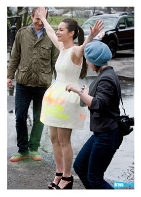
 Stow the spotlights! Can the canapés!
This week, the remaining eight artists take to the streets as they get in the mood by covering China with graffiti. It’s the Street Art Challenge!
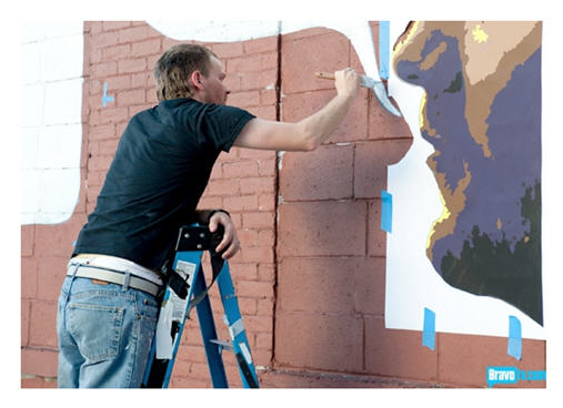
The participants are paired up and assigned massive stretches of exterior brick wall as their canvas.
A little extra incentive? A $30,000 cash prize to the winners.
As for the teams, it’s Kymia and Sara J, The Sucklord and Sarah K, Dusty and Young, and Lola paired with Michelle.
This week’s guest judge is none other than Lee Quinones, a key figure in New York’s Subway Art Movement. Be sure to check out some of his images. You’ll see why color, scale, and directness of design are essential to street art with impact. And Simon counsels the artists to keep it simple, remembering they’re painting and installing on huge walls during the middle of the night.
So what makes for “good” street art anyway?
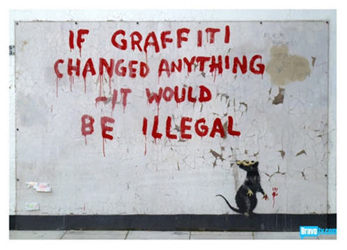
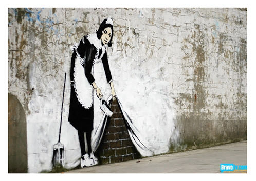
Think about it. We’ve all seen it – rebellious or raucous, raw or polished, surreal or snarling – frequently potent in its use of text, or purely reliant on imagery and color. Take a look at these two examples, courtesy of Bravo TV, from renowned British street artist Banksy.
Check out these images to see more of Banksy’s work. It’s fantastic!
Street Art That Falls Flat
When it comes to subway art or street art, we view it as part of the urban landscape when we’re walking by in a hurry, or moving in a blur by car, or hurtling along by train. We react from a distance, the experience is visceral, and we may only have a few seconds to take in what we see.
Delicate? Dainty? Scattered composition? It doesn’t work.
 The concept and execution of Lola and Michelle’s crazy piece was off the mark from the start. Attempting to illustrate an imaginary scene of debauchery, they seem more interested in painting penises than creating a raw and real work of art.
The result is a mess.
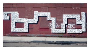
The Sucklord and Sarah K decide on a theme of city labyrinth. Let’s give them, oh… zero points for originality and ditto, for the execution. Trying to add a 3-D element was interesting (okay, I’ll give them points for that), but like Lola and Michelle, they’ve ignored the heart of street art, and their efforts fall flat.
Street Art That Works
 I can’t say I love Sara J and Kymia’s piece, “Reroot” – a mural that deals with issues of being uprooted from one culture and dragged off into another. Still, their collaboration yields a large work that catches your eye from a distance, and is intriguing enough for you to look more closely.
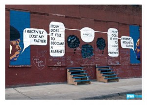
Dusty and Young’s “conversation” is the obvious winner. In finding a common bond through their own discussion, they realize that during the time when Young’s father was dying, Dusty was becoming a first-time Dad. Each of their lives changed irrevocably, and the cycle of life is neatly depicted in this effective exchange.
Their mural is universal in its message (birth and death changes us), simple but striking, and inviting viewer interaction with text and talk bubbles.
Also notice that the basics of composition are not sacrificed to silliness. (Lola, take a lesson. The eye has nowhere to go as it visits your so-called perverse party panels.)
Sayonara Sucklord
 As for the departure of the Sucklord (yes, he got the axe), he seemed to be the Pseudo-Villain with a flirtatious heart of gold. Here’s hoping the ladies won’t be too misty without him. They seemed to enjoy his “toying” with their affections.
And if you missed an episode, pop by here.
Images courtesy BravoTV.com. Click on images to access Bravo TV’s originals.
© D. A. Wolf
Leave a Reply