Extra! Extra! Read all about it!
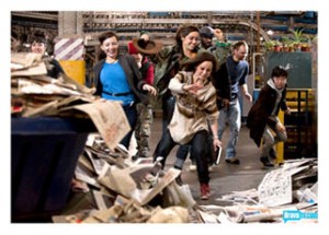 Simon rousts the artists in the early a.m., they take a road trip beyond the city skyscrapers, and find themselves watching the New York Times presses roll.
The challenge?
They’re to rip their inspiration from the headlines – literally – and incorporate newspapers into their artwork.
Extra incentive? A $20,000 cash prize, and the winning piece – displayed at the Headquarters of the New York Times.
Cutting to the chase – to and through heaps of papers – they skim, they rifle, they read – then haul off stacks of newsprint as material for their artworks.
Headliners? Show Stoppers?
By this point in the season, the viewers have a good feel for some of the headlining stories for each artist – their themes, their worries, their preoccupations – some of which are confirmed as we observe their choices of subject matter.
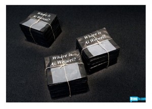 Young decides to create a conceptual piece on censorship, as he goes for the article on Chinese artist Ai Weiwei, whose work led him to “disappear.”
Kymia dives straight into the macabre; she plucks a serial killer from the news, and crafts a monster coffin of plaster and papers, with body parts peeking through.
Michelle, who repeatedly plays on themes of death, unearths an article on documenting injuries; she asks another artist to photograph her fading scars from a near-fatal accident, to be integrated into a successfully autobiographical mixed media work.
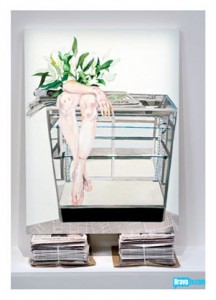 The Sucklord is lost, clearly disheartened from previous grilling by the judges. He chooses his subject poorly, and without personal connection, to do with the BP Oil Spill and a billion dollar payout.
Bayeté is intrigued by a headline on the glitz and glam of religion, Sarah K is seduced by a tale of lost sanity, and Sara J opts for the impacts of the Japanese tsunami.
Lola, a bit of a wild card, picks an unlikely topic on inadequate Libyan arms, while Dusty more thoughtfully zeroes in on the troubling economic climate that stretches across America.
Text Me So I Know I’m Here (The Guest Judge)
Bearing in mind that a critical part of this challenge is utilizing the newspapers theselves, several artists cleverly incorporate text, while others use the papers as their medium.
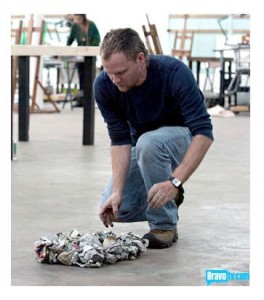 Kymia, for example, constructs a wooden coffin as her base, but she fills it with newspapers along with her molded body parts. Young uses stacks of newspapers in their entirety, and Dusty laboriously crumples and affixes his to a large scale design.
Lola makes unexpected use of her own handwritten text, while wrapping tools in newspaper to engaging effect. Sarah K attempts to use shreds of copy, though her composition is so scattered and esoteric that it falls flat.
It’s worth pointing out that self-taught (outsider / art brut) as well as Dada, Pop, and contemporary art utilize text. Whether its usage is to your liking or not, words can reveal fascinating clues to the creator’s mind space, while proving to be visually versatile as a bold statement or delicate compositional element.
This episode’s guest judge is Adam McEwen, a New York-based British artist. He has a rich body of work that includes renditions of texting, along with a much lauded series of newspaper-based visuals – obits of the rich and famous – who are still among us.
The Losers, The Winners; Always a Bridesmaid?
At the bottom of the heap? The Sucklord, Sarah K, and Bayeté.
 Coming out on top? Lola, Dusty, and Young.
It seems the simplicity of Young’s conceptual statement is a winner with the judges, and he takes the prize. I admit the issue is vital, and the visuals direct, but I wouldn’t have given this artwork the ultimate Thumbs Up.
Lola’s combination of drawing, unexpected hand-written notations, and imaginative newspaper-wrapped tools and weaponry is surprisingly engaging. Take a peek at her Inferior Arms Hobble Rebels in Libya War.
In contrast, Sarah K’s attempts to depict a descent into madness lack cohesion, which Lola manages to achieve. Sarah K’s elements are so cryptic, you can make anything of them or nothing at all, as the judges point out.
And I agree.
The Sucklord’s offering is nothing much; the judges are unimpressed, and again, I agree. He tosses a first literal attempt at representing the Gulf Oil Spill, only to finish with another literal (and uninteresting ) expression of big money, big media, and special interest.
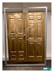
Had Bayeté’s execution not been so poor – (his concept showed merit) – I suspect the Sucklord would have been out the door. Instead, Bayeté’s gold painted entrance to nowhere led to his exit stage left.
So what about Dusty, taking another Runner-Up spot? Always the bridesmaid for this imaginative and hard-working artist?
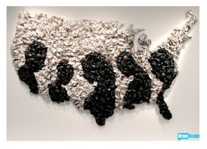 I like his interpretation of the “Darkening Mood Across America.” His process begins by posing and photographing some of his colleagues in silhouette, with heads bowed. From that image, he creates a striking newspaper rendering of the United States, suggesting the economically disenfranchised. I find the result far more skillful than Young’s artistic blackout, and certainly more impressive.
Images courtesy BravoTV.com. Click on images to access Bravo TV’s originals.
© D. A. Wolf
I am really enjoying your recaps, Wolf. I feel like I actually watched the show and can nod my head with you as you explain those pieces of art you liked, disliked, and where you think the judges went wrong.
So glad you’re enjoying, Amber! (I think the show has improved this season.)
I’d have to agree with Amber.
I tend to watch the show and then get online to see what you have written about it.
Anywho, I’m honestly surprised the Sucklord is still in. He hasn’t made anything that I was too impressed with and he has never been on top. Granted Bayete’s work wasn’t very good either and probably did deserve to go home for it. Sara K’s, I just didn’t even get.
I, personally, didn’t like nor understand Lola’s piece so when it was in the top I was like “really?!”
Dusty’s work I really liked. I think it could have/should have won.
I would have given Dusty the win as well, Luka. And probably on the child’s art challenge, too. That said, I try to keep in mind that we can’t see the work close-up as the judges can. (It would be fun to see it, wouldn’t it?)