Kick the can?
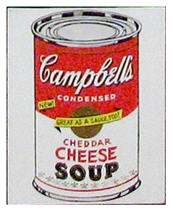 Not quite. Episode 3 of Work of Art leads the participants off the elevator and through the Phillips de Pury auction house, as they follow a trail of tin cans straight to the Holy Grail of Pop Art – Andy Warhol’s iconic Campbell’s Soup can.
It’s the Pop Art challenge!
Holy Marilyn! Not a bad idea, and the winner takes home a two-page spread in Entertainment Weekly, while a double elimination awaits those who don’t measure up.
As to Pop Art (in case you’re wondering), it had its infancy in the mid-late 1950s, and hit strong by the 1960s. It utilized common objects, not considered Fine Art fare, and transformed elements of popular culture, mass consumption, advertising, logos, comic strips, found materials, and kitsch into deceptively thoughtful creative conversations. Pop should indeed pop, intended to engage in a striking way, pushing us to think beyond its surface, and often doing so with wit or irony.
As Simon says:
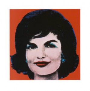 Pop is bold, pop is brave, pop is sex, pop is life, pop is fun, pop is brash, pop is political – so make it pop!
Holy Jackie O!
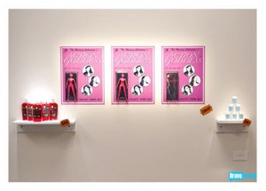
The Sucklord thinks Pop is about celebrity worship – he decides to pay homage to Charlie Sheen’s downfall – kitsch, color and everyday objects form the foundation of his artistic arsenal; he’s right at home, and the judges enjoy his installation.
Holy Coke Bottle!
Michelle “updates” Coca Cola with a painting of Coke Zero on a cell phone! Egads!
 Dusty fiddles with fast food but veers into Robert Ryman white, and a minimalist trash receptacle that most of the gallery visitors pass by, perhaps thinking it’s a, well… trash receptacle!
Bayeté?
Holy Hiccup! At least he’s got immunity and the judges don’t let him forget it.
Tewz manages to amuse with a FedEx truck installation transformed into FadEx, which offers a soupçon of statement and hint of humor (though not much more).
Kymia’s concept is catchy; she stages a side-lit photograph of herself displaying a water bottle which not only sells the art of selling (as Jerry Saltz points out), but addresses the contradictions of our consumption of bottled water for health, while polluting the planet with littering.
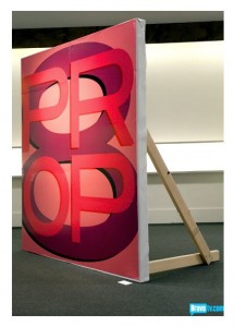 Young’s winning billboard carries the day, addressing California’s Proposition 8 (Prop8) banning gay marriage, and evoking echoes of Robert Indiana and his 1964 LOVE sculpture.
Young’s painting wins with its sheer impact and the appeal of interactivity – gallery goers can graffiti on the back. Moreover, it’s the only artwork that would make a decent impression in a magazine spread!
The guest judge, Robert Pruitt, was known to the artists. But it’s a shame more of them didn’t note the graphic quality of his work – not to mention the opportunity for lavish, primary color.
I admit to something less than shock and awe over this episode, but found it thoroughly enjoyable to watch. I was surprised that these artists seemed less aware of Pop’s visual characteristics than I would have imagined, as if a handful of Warhol images were all they knew.
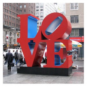 Warhol may be the most famous Pop artist to the general public, but he surely isn’t the only one.
How about Robert Rauschenberg? Robert Indiana? Jasper Johns? Jim Dine?
How about Roy Lichenstein’s 1966 Batman?
Simple, strong imagery – and color, color, color!
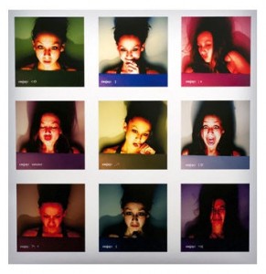
As for other outcomes, Sarah J’s photographic work successfully addressed the ubiquitous existence of online dating, depicting an unexpected assortment of expressions not typically part of a profile. She gets a pass in my book for having produced something which met the criteria of the challenge, and is not uninteresting to look at.
 Jazz-Minh’s confused narrative of Britney Spears and her own bite me lip tattoo made little sense, and her end product held nothing of Pop’s particulars, making her a definite “out.”
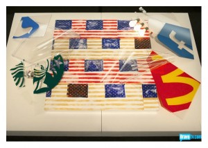
But it is ironic that Leon, seemingly savvy as well as talented, was the second artist eliminated in this episode. He seemed to understand the challenge, though I agree with Simon that the American flag had been “done,” which meant Leon had to knock it out of the park.
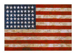
After all, there is Jasper Johns’ 1954 rendition (among others), widely known, as is his 1961 map of the US, interpreting the country in a vibrant patchwork of states.
As for Leon’s attempts to collage elements of logos or advertising together, sadly, his efforts offer little depth or pleasure in the composition. The eye doesn’t know where to travel; the visual impact is neither a journey nor adequately focused.
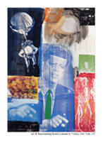
 Furthermore, he conjured (badly) another iconic Pop artist, Robert Rauschenberg, whose 1950s 3-D assemblages known as “combines” moved to silkscreens in the 60s as Pop emerged, and his large scale images culled from newspapers, magazines, as well as photographs of political leaders – in particular, JFK – are striking and again, widely seen.
Holy Heartache! But can’t we give Leon credit for being on the right track?
 Having read Jerry Saltz’s blog on Bravo last week, I recall that he said the artwork appears quite differently in the gallery than it does on television.
I have no doubt that’s the case, but Dusty over Leon? Perhaps the judges believe we haven’t seen Dusty stretch his wings just yet. Still, his conceptual and dreary work had nothing whatsoever to do with Pop.
As for this episode overall, I notice more footage of artistic process than last season (thumbs up for that), less sexual silliness (so far) despite the flirtation between the Sucklord and Lonely Lola, and nudity that hasn’t jumped to Jaclyn levels as yet.
 As for who stays and who departs, I’ll more or less concur with this week’s judging, though I will certainly will miss Leon’s participation.
Work of Art photographs courtesy BravoTV.com. Remaining images are public domain, or link to AllPosters.com, or are provided as thumbnails. Click on images to access originating sources.
Leave a Reply