I’ll just say it. Sheepishly. I was looking forward to the Season 2 opener of Work of Art (The Next Great Artist).
 Though I was hoping the producers would trash the last part of the show’s name (I mean – really?), nonetheless, I enjoyed last season and the dialog on contemporary art that went along with it.
Love the show or hate it – people were talking about art. Okay. Some people. But since when (in this country) does anyone but an elite few discuss contemporary art?
Last night I tuned in, crossing my fingers (and toes and legs) that the new season might bring some chipper and choice changes. You know – lessons learned from Season 1 – that would entice those of us who genuinely love art to eek our way through this experience again, preferably, less irritated. Yes, I did say EEK.
And I was less irritated.
I was also bored.
Some of the issues I had with last season include a desire for less ridiculous challenges (to better show the artists’ talents), a greater view into the artistic process, and a more consistent caliber of participants. Additional context for guest judges and their bodies of work could also help – in offering more visual training to the audience, and in positioning their credibility and their inclinations as they form their opinions.
 So how did Bravo fare with the Season 2 opener?
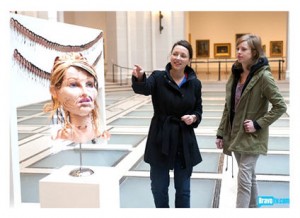
I found initial scenes encouraging, as the artists gathered at the Brooklyn Museum to meet, and give the once-over to each others’ self portraits, already completed. The diversity of mediums was promising, and the work, occasionally witty.
Hello? Pulling a Chuck Close but doing so with crayons? The public elementary school teacher from Arkansas (Dusty) was playful in his approach to art.
The gag-me representations of mauled internal organs? (Color me contestant Kathryn… ) Um, not my thing, though perhaps this artist would fit neatly in last season’s shock meets schlock Andres Serrano episode.
The paper sculpture from Michelle? I found it interesting. The nude hospital photograph from Young? A little creepy, but that’s exactly the point.
Plenty of potential in this bunch.
 As for the challenge – take “bad” art – kitsch – and make it your art (and gallery-worthy) – I can’t say I love it. What’s worse, I found the results to be a bit ho-hum.
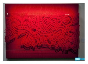
Cutting to the chase – out went the French hottie, whose red-on-red was repeatedly deemed derivative of Keith Haring. Well the red-on-red didn’t work (I agree), but Ugo (love the name!) is producing line drawing-based semi-abstract outsider art. It’s an aesthetic I’ve seen in a particular group of self-taught artists (art brut), with a tradition that might include Augustin Lesage, certain works of Jean Dubuffet, as well as contemporary (European) “outsider” artists like Jean-Pierre Nadau (for example), who work with obsessive, chaotic, and curvaceous line. For that matter, look closer to home, to Chicago based John Himmelfarb, whose delicious paintings and prints tangle us up in a pleasurable ours-to-decipher journey.
Ugo is hardly Dubuffet, but his work certainly goes beyond “derivative Haring.”
Funny how the so-called abstract artist was first to go last season, and ditto, in Season 2. Oh Lord (not SuckLord) help us… are we already doomed to fall into a figurative finale?
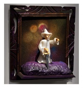
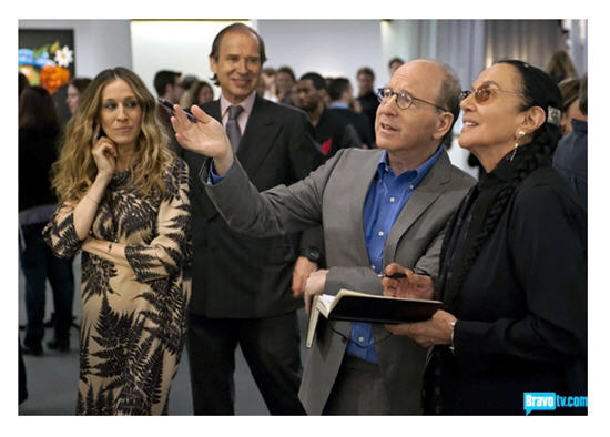 So Ugo gets the boot (too bad – the girls seemed to like him), yet a gentleman who goes by the name of “The SuckLord” is in, despite Jerry Saltz’s apparent dislike for the work (I quite agree) – a kitsch-to-kitsch reinterpretation of a ghastly painting into an even ghastlier 3-D version.
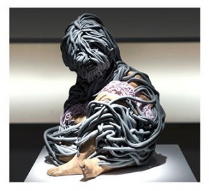 I admit already to my prejudice; reworking toy parts into pop culture commentary is not likely to be my thing. Perhaps I’ll eat my words, but that remains to be seen.
As for Kymia’s quirky catastrophe? Ugh, not Ugo.
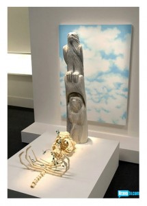
Cue the winning artwork – Michelle’s depiction of a gravestone marker out of an eagle totem, a tenderly assembled skeletal form, and a background of blue sky. I can appreciate the skill and find the result “fine,” but little more.
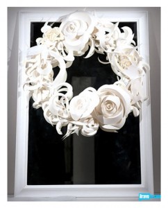 I much prefer Leon’s construction of a floral wreath affixed to a white frame. It is both strikingly contemporary and unexpectedly romantic.
The judges seemed to incline toward the narratives that each of their preferred artists were suggesting – something that is important in conceptual art and likewise, “outsider” or “self-taught” art. Still, it surprised me that they were guided by storytelling to such an extent on this challenge, and at this early stage.
To me – the work still needs to stand on its own – in visual impact, in use of materials, and strange perhaps coming from one who writes about art – but without words of explanation or narratives of near death to give it “stature.” Context should provide a gateway in, but I will say again – the work needs to stand on its own – as beautiful, as poignant, as disturbing, as arresting.
 As meaningful or visceral in some way, without a word exchanged in its “defense.” Description or elaboration should enhance the experience of viewing an artwork, not be required to make anything of it whatsoever.
By way of example, Leon’s “Heaven and Earth” accomplishes that. It needs no explanation. The eye is drawn to it, travels its contours, muses along the journey. As for narratives, it could provide many if you seek them (including death – always a winner in art circles it seems), while displaying both a particular vision and serious skill.
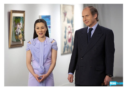
Overall, I found Episode 1 to be a yawn, with one exception – China Chow’s lavender wrap-me-up-in-lattice dress. Um, a Project Runway reject?
 More fun? The Just Desserts episode that followed. That one-handed pie-baking quickfire?
Fabulous!
Images courtesy BravoTV.com
© D. A. Wolf
I am watching very little TV these days and have sworn off all Bravo for the moment (until the original recipe Top Chef returns, of course; Just Desserts bores me). But your Work of Art reviews from last season eventually roped me in so keep it up and I may just succumb!
I’m keeping all my appendages crossed, Kristen – that things will pick up. And as you may discern, the one hope for abstract or “outsider” (art brut) art got axed off the show last night. Grrrr. Why is the American public so unyielding when it comes to some of the more intriguing (challenging?) forms of visual art?
Do click the links on this post – and check out Chuck Close, Augustin Lesage, Jean Dubuffet, Jean-Pierre Nadau – and Himmelfarb is a modern/contemporary hybrid whose work is delicious!
Glad you’ll stick around for the reviews – and the show!
Yes, the show was a let-down. Ugo being sent home was also. I could have spent more time looking at and listening to him. SuckLord (WTH?) should have been out the door.
I do remember being disappointed in the first episode last season too and I ended up enjoying the show nonetheless. I’ll continue to watch.
Will miss Ugo, won’t miss the line drawing… it is not my cup of tea.
Now that you mention it, Cathy – last season’s opener was indeed a let-down. So from here, they can only go up, right?
Oh, I was oh so excited for this season of Work of Art. I adored the last season, so I had my hopes up for this one as well.
I did, indeed, find the episode pretty boring though. I couldn’t really get into the show, other things going on around me kept getting more interesting than what they were working on.
I’m hoping that it will get better though. ^^;
Lovely to have you join the conversation, Luka. I’m thinking it will pick up steam over the next week or two as well.
I have to say I’m intrigued. But I think I like your review more than I’d like the show. These people need to hire you.
Last night’s episode was more entertaining (to me, at least). And more on that, shortly…